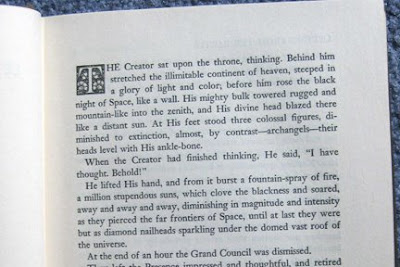
This is an image of the first page of Mark Twain’s “Letters from the Earth” edited by Bernard Devoto, ©1962 The Mark Twain Co. and published by Harper & Row, NY.
The book is a novel by Mark Twain that I checked out of the library to read. It was written to entertain and also to make people think more deeply about God and his creation of the world. This page is the first page of the novel.
What caught my eye first on the page is the capital T and the ornate box that it is enclosed in; it is reminiscent of Geoffrey Tory’s criblé and floral initials that he created in the 1500s. It has floral design as well as the criblé markings (the small dots) in the empty spaces. It is smaller and uncolored, though, while I think Tory’s initials were larger and usually in color.
I also looked at the typeface used for the book: Linotype Janson. When I looked it up, I found that it is based on a 17th century Hungarian old-style serif typeface that looks similar to many of the old-style typefaces we have been looking at in class. It uses ligatures for certain letter combinations, such as ‘fl’, which I usually don’t notice in most books I read—though perhaps I just pay closer attention now that I am more aware of them from the class!
Also, we obviously see the “modern” clean and simple design of the book with its empty and wide margins around the text.
I like the fusion of the old and new that this book presents; with the subject being religious in nature, I think it is fitting to have an old-style typeface as well as ornate initial on the page. The modern book design, though, allows the book to fit into modern-day standards and norms that we are used to so that it is still easy to read.
Sources: http://en.wikipedia.org/wiki/Janson
Once again, this is an example of a person using typeface and design to bring a reader in, and in this case, bring a reader to a book regarding God. Even though the whole point of illuminated manuscripts was to attract people to Christianity, you can still see how it is used and applied years later. I do find it interesting that he used ligatures. And as for the modern-day standards that are combined with this type style, you can see how the alignment of the words throughout the page follows today's standards but the "T" in the block is from generations before. Good find!
ReplyDeleteThis is a great transitional piece from the old more gothic forms of text to a more modern typography. You can really see the influences, in the emphasized first letter. The font that the piece it's typed in is really unique as well. At first glance it is almost a times new roman feel to it. It's only when you look closer you notice the subtle differences.
ReplyDeleteVery interesting find! Like you, I've never noticed the ligatures until this class - particularly in our text. I love how you compare the ornate capital to Tory's work, as well as the information about the font. Like Manda, I would have thought it to be Times New Roman. I also like the point you brought up about the fusion of old-style and modern. The overall feel is older, but the printing is modern.
ReplyDelete