Friday, May 15, 2009

Designers presentations

Kyle Cooper

Cooper studied at Yale School of Art under Paul Rand, who influenced his studies and design. His style is artistic and abstract but very versatile, staying true to each individual film. Some of the films he did title sequences on include Se7en, Spider-Man, Dawn of the Dead, and Curious George. He experiments with playful typography in the sequences a lot. He also does animation for TV spots on top of the many movie projects that he does.


Shepard Fairey

Fairey started designing as a teenager, even designing skateboards, and then went to RISD after high school. His style is similar to art deco and incorporates sunbursts, dark colors, hidden messages (political, etc.), bold colors and sans serif fonts. He designed many posters, like his “Andre the Giant”, Obey, Obama, and Black Sabbath posters. He wants people to question his work, especially his Obey posters, to question things in life like authority that we subscribe to. 

Wednesday, May 13, 2009

5/13 designers

Clement Mok
Mok began in the 1980s working for Apple, and was able to help create some of the applications that we use today. Clement Mok Design was his own company that he opened after his career with Mac. He was a designer, publisher, web developer, and software developer who knew how to design both with and without a computer. Geometric lines, bold colors, and symbolic/abstract components are a big part of his style. He has been focusing on web design over the past decade or so. He is the co-creator of AIGA, his artwork has been featured all over the world, and he has worked for many Fortune 500 companies.

Leo Burnett
Burnett is a famous copywriter and advertising executive who is famous for creating many company mascots like the Marlboro Man and more. He began his own company in 1935 in Chicago and ran it successfully until he retired in the 1960s. Some of his more famous icons are Tony the Tiger, the Pillsbury Dough Boy and the Starkist Tuna.

Monday, May 11, 2009

Designers - Monday 5/11

Tibor Kalman

Kalman had a hard childhood and was isolated because he was originally from Hungary, but this only helped his work. He was a social activist and liked to design things to help social issues. He once designed a flyer about Esprit and their shady practices in clothing manufacturing. In 1979, he opened the M&Co. design firm with his wife in New York City, which worked on magazines, film titles and books mainly. Kalman became famous for his Talking Heads CD cover, which pushed the conventions of design and typography, elements of his style that were pretty consistently pushed in his other work. He worked on Colors Magazine also to help promote his social views to the public on women’s rights, race, and other issues.


David Carson

Carson is widely known for his innovative designs, experimenting with typography, and his cluttered, unstructured style. He didn’t learn about the rules of design, but instead focused on an emotional impact, not caring about breaking the rules. He was mostly self-taught, and his designs focused on one big idea, used asymmetrical layouts, had intentional mistakes, no grid and varying typefaces and sizes. As a pro surfer, it is easy to see the influence the laid back lifestyle has on his work.


Matthew Carter

Carter is seen as the “father of typography.” His own father was a typographer, and working with him greatly influenced him. By the time he was 30, he was doing freelance typography work. With technology rapidly changing, his work went digital. In 1991 he started Carter & Cone Inc., a typography foundry. He is famous for creating Bell Centennial, the phonebook typeface, and Verdana for Microsoft. He also is famous for creating ink traps in letterforms, which allows low-quality printing without bleeding letterforms that would stay legible.

Friday, May 8, 2009

Designers - Friday

Neville Brody

Early in his life, professors didn’t approve of Brody’s style because it reflected the rebellion of the punk movement too much. Upon graduation, he found his niche in the music industry working for several labels designing CD covers, posters, etc. He quickly moved up in the world and became the art director of Face magazine after just two years. His work there made him finally be recognized as an influential designer. He also started Fuse magazine with several other designers, and in 1988 the world’s best selling graphic design book was published, a book all about Brody as a designer. His work uses a lot of contrasting colors that pop off each other, as well as playful, inventive use of typography.


Art Chantry

Chantry was influenced by his grungy childhood in southern Washington, growing up poor with his mother after they left his abusive father. He was also influenced growing up in the 1960s by rock and roll, psychedelic spirit and punk. He avoided technology and instead he uses a lot of found imagery, altering it and incorporating it into his designs. He liked to manipulate materials by hand, and used many various typefaces and even their woodblock forms.


Storm Thorgerson

Storm uses a lot of layered imagery and creative photography, and his most well-known projects are CD covers from the 60s and on. He worked a lot for Pink Floyd and his Dark Side of the Moon cover is a famous piece. Many of his designs featured a large, central object with a smaller object next to it to create tension and questioning. 

Wednesday, May 6, 2009

Designer Presentations

April Greenman

Growing up, April was supported by her parents and great aunt and inspired by their teachings. Her mother taught her about dancing, which in turn taught her lessons about not “faking” anything, which led her to prove herself in design later. Likewise, her aunt taught her to work hard for her dreams, and this hard work made her a success in the design world. She went to school at RISD, then the Kansas City Art Institute, and finally the Basel School of Design in Switzerland. She learned about New Wave design, which greatly influenced her work by playing with the weight, space, size and angle of typography, which gave dimension to her designs. She later taught at Cal Arts and now owns her own design business.


Milton Glaser

Glaser when to an art high school and college and then studied in Italy on a Fulbright scholarship afterwards. He created Push Pin Studios with three other designer friends in 1954 and was President for 20 years. In 1968 he founded New York Magazine, which became a model for many magazines. In 1974 he founded his own business, Milton Glaser Inc., and then in 1983 he also founded WBMG studio. In the 50s, his work was direct, simple and original; in the 60s it was characterized by contour lines and flat shapes; in the 80s and 90s he explored illusion and dimension.


Seymour Chwast

Chwast enjoyed using illustration, woodcuts, design and speedball pen and ink. He was a part of the Push Pin Studio and helped create the Push Pin Almanac. He was responsible for many poster designs, which were his favorite thing to design because he liked the explore the interaction between type and image. He also wrote and illustrated a number of children’s books.

Sunday, April 19, 2009

Thesis statement

Stefan Sagmeister is a world-renowned innovative and influential designer who allows his soul to shine through his work, reflecting his personality while still communicating effectively.

Tuesday, April 14, 2009

Psychedelic Posters

“Poster mania” took place in the 1960s as an American poster craze that embraced the social activist spirit of the young nation. Its grassroots beginnings came from self-trained designers and artists who gathered inspiration from art nouveau, comic book, and pop art, among other art movements. These posters used flowing curves, recycled images from popular culture, intense colors, swirling imagery and warped letterforms. The posters related “anti-establishment values” and commented on social movements like civil rights, the Vietnam War, the women’s liberation and the search for alternate lifestyles. Artist Peter Max (with his “Love” poster), and David Lane (with his symmetrical, contour, simple lined posters) were two of the influential poster designers of the psychedelic poster mania.

I really liked the flowing nature of these posters and how well they represent the era that they were created in. The colors and visual vibration resonate with the “psychedelic mentality” of the public that were viewing the posters. The imagery and color really helped to convey the mentality.

I just wish that there were more recognizable poster examples given in the book; or from sources that we would recognize, like propaganda for the Rolling Stones, etc.

Tuesday, April 7, 2009

Ch. 21 Conceptual Image

Chapter 21, "The Conceptual Image" is about an approach that came from Poland, United States, Germany and Cuba. In Poland, after WWII began, the design community basically came to an end until Communism was established. However, only state-controlled institutions and industries requested design work. Trepowski was a famous Polish poster designer because he was able to reduce imagery and words into a succinct statement. Tomaszewski was famous because after all of the somber and darker posters, he re-embraced a brighter, positive, colorful world of poster design. Jerzy Janiszewski was also an important figure because of his Solidarity logo design, which was a symbol worldwide for struggle versus oppression.
In America, photography began to replace illustration beginning in the 1950s. A more conceptual approach was then born for illustration; the “Push Pin” designs expressed an openness and reinterpretation of visual imagery, as well as an integration of words and image into a total design. Chwast and Glaser were two of the influential artists of this time with their experimental magazine, poster designs, and Glaser’s contoured, flat shapes of color with black outlines. These two also invented some novelty display faces. In 1980, design finally became a truly national profession for Americans.

I was really impressed with the Poland school of design and the community that outlasted the Communist reign and restrictions. I think it shows that design is an important part of this world if it could outlast the evil of those days, as well as keep a bond between professionals and create a community for them, even when illegal (Solidarity).

The question I have is about the advancement of illustration in the US after the 1950s. I can see the uniqueness of Glaser’s illustration, using black contour lines and flat colors; is this what the evolution was, or were there other major advances in illustration?

(I presented Chapter 20.)

Monday, April 6, 2009

Ch. 18 & 19

Chapter 18, The International Typographic Style, is about the 1950s movement that came out of Switzerland and Germany, also known less formally as Swiss design. These designs were asymmetrical yet very organized on a mathematically-structured grid. Objective design and copywriting did not put exaggerated claims on the design either. These designs also typically used sans-serif typography, set in flush left/ragged right paragraphs. It was seen as progressive design that was socially important. Ernst Keller set the "standard of excellence" for Swiss design, and the Basel School of Design was a major influence in its geometrically-based curriculum. Many widely-used fonts came out of this design time, too, such as Univers (by Frutiger), Helvetica (Hoffman & Miedinger) and Palatino, Melior and Optima (Zapf). The design style caught on quickly, becoming widely used in the 1960s corporate and industrial graphics, specifically by MIT. 

Chapter 19 is about The New York School, the influence of modern art/Swiss design on American design from about the 1940s-1970s. Paul Rand was a major influence, putting his knowledge of the modern movement into major graphic design. He designed many magazine covers, reducing the design to the symbolic essence that he wanted to convey--he used universal, ordinary signs and symbols to translate his visual ideas, and often used juxtaposition of  colors, ideas, or imagery to make a statement. Lustig, another important designer, used symbolic imagery to convey an essence of the contents of a book on its book cover. Yale University School of Art also had a major influence at this time, with Josef Albers as the director of the art school, and Eisenman as the director of the graphic design program. George Lois was a master at this time of completely integrating visual and verbal design, which he executed on many Esquire magazine covers, among other things. 

What I found most interesting in this chapter was that figurative typography was just emerging. Gene Federico was one of the first graphic designers at this time to use letterforms as imagery. Type also finally began to have connotative meaning in compositions as well. 

One question I have is, why did it take so long for typography to be used as connotative expression? Couldn't the Dada or futurism compositions be considered exploration of connotative typography? 

Sunday, April 5, 2009

Weekly Sketches

Once again, I redesigned the Heinz ketchup label. The first design is inspired by Peter Behrens’ design in the early 1900s. His designs were very structured and geometrical, so I changed the shape of the label itself to be a rectangle with 90 degree angles, and then used linear elements as well as circles. I used the circles, which I would make red (to echo the image of a tomato) to hold each letter of the word ‘Heinz.’ I then made the bottom portion of the label primarily circular, but still intersected with some linear elements. Overall, the design is clean and neat and geometrical, like Behrens’ work. As for typography, Behrens used a bracketed serif font; on this matter, I would depart from his influence and use a simple, bold fat face. I think the thick, bold type would stand out more, as well as keep the clean and simple look of the label.

The second label is inspired by the Plakastil movement. The posters of this era used reductive imagery and flat planes of color. I mirrored these characteristics in my design by making the main imagery a giant red tomato with a simplified green leaf/stem on the top. Plakastil experimented with placement of type somewhat, so I aligned “Heinz” on the curve of the tomato to make the type and imagery work together. I think I would use a fancier font for this design, as Plakastil posters also experimented with sometimes.

Sunday, March 29, 2009

3/29

The poster that I found had the most emotional impact on me was this poster:
http://www.allposters.com/-sp/Bravery-Posters_i372196_.htm
It is a poster of a soldier on the ground pointing his gun outwards, towards the viewer. The picture is lifelike and realistic, this is what the soldier must do--and seeing that is emotional enough. But on top of that, the gun is aimed at the viewer, which gives the feeling of being under fire, or at the wrong side of the gun. It makes me very uncomfortable to look at the poster because I feel like I am about to be shot down.

Sketches


This redesign of the Heinz ketchup bottle label is influenced by the Victorian era. I wanted to use typography that was more decorative and thick to make the “Heinz tomato ketchup” words stand out on the label, especially “Heinz.” I also put the word “tomato” on a curved angle, as that is representative of many Victorian era products as well. I carried the thicker, decorative type through to “America’s favorite” but on a smaller scale so that the phrase would not compete with brand name. Finally, I added a lot of embellishment through straight and scalloped lines around the border, as well as scrolls and curves in the white spaces to make sure I filled all of the larger areas of white, as Victorians did not like to leave any white space.


This second redesign of the Heinz ketchup bottle label is influenced by the Arts and Crafts movement. For typography, I was inspired by the woodtype typeface “Neuland” by Rudolf Koch, which was a slightly imperfect carved block letterface with very thick, even, angular strokes. I used smaller, contrasting types for less important words in the label to balance the thick, larger and more important words. Arts & Crafts design used very organic line-made elements, as well as celebrated nature, so I tried to do the same through using a tomato and vines to make linear elements that moved throughout the whole label, making it very busy, just like arts and crafts design. Also, the placement of the type was generally put near the top or bottom, so that is what I did with most of the type on the label; I wanted the Heinz pickle to stand out, though, so I put that more towards the center as one of the main elements as it is a brand identity for the company.

Friday, March 27, 2009

Readings 2/27

The American posters that were designed during WWII had many of the same elements that we have seen during these years when modern art influenced design. The posters are rather simplified and straightforward, with pistorial representations and limited color range (black, red, white, yellow, blue) to get direct points across. The war posters are especially dramatic as they hit on social, political and ethical nerves.
American Kitsch, on a completely different note, is the opposite of the simple designs that we have been seeing lately. Kitsch is often described as tacky, trashy, nostalgic or just plain junk. Some people can appreciate kitsch because they can find humor in how terrible looking a piece of art/collectible/carving/etc is. While I think this is funny to a point, I only think it'd be funny if someone else actually thought it was good art and one could laugh at how bad it really is. But who really knows what's good and bad?

In relation to WWII posters, I especially noticed Ben Shahn's poster about Nazi cruelty, which features a stiff man with a bag over his head and text saying that all the men of a Czech village have been killed. Even the brick wall in the background is striking as it brings about the imagery of the concentration camps and brick ovens to mind. It is an eerie and striking poster.

What are some other examples of kitsch? For some reason, I keep recalling to mind old garage sales I went to and all the old ugly figurines that I'd find at them and wonder who'd ever buy them.

Tuesday, March 24, 2009

Postcubist Pictorial Modernism

The reading for tomorrow’s class is about the postcubist pictorial modernist movement that occurred approximately around the 1920s-1930s. This movement, known as art deco, created graphic design that was geometrical and influenced by cubism, Bauhaus, the Vienna Secession, De Stijl and suprematism. One key graphic designer who used art deco was Edward McKnight Kauffer, who moved to Europe after seeing the Armory Show in Chicago in 1913 and decided that Americans were not yet attuned enough to the modern art movement. He applied modern art to design, particularly poster design, creating 141 posters for the London Underground. Other influential designers were A.M. Cassandre, who was a master of integrating words and imagery into one total design, and Jean Carlu, Paul Collin, Austin Cooper, and Joseph Binder.

I found it interesting that Cassandre went back to the Roman alphabet and tried to recreate it anew with the Peignot alphabet. Using all capitals as smaller forms for the lower-case letters was definitely different than people were used to reading as normal body text, it is not a comfortable way to read now that we are so used to reading lower-case letters. I think that is why Cassandre’s attempt to revive the Roman alphabet was unsuccessful, though it can be appreciated.

When did modern art/art deco finally come to America and influence the graphic designers here?

Thursday, March 12, 2009

Chapter 15 Summary

Chapter 15: A New Language of Form

This chapter discusses how the Russian suprematism and communism influenced graphic design through the use of a “cubo-futurism” style that experimented with typography and design, as well as “suprematism.” This painting style of basic forms and pure color was founded by Kasimir Malevich, providing a new, nonobjective geometric abstraction to graphic design. Art was seen by constructivists as a social/political role, a duty for artists to fulfill. El Lissitzky was a large influence on constructivism; he created the PROUNS painting style of 3D illusions, which showed the “interchange between painting and architecture.” He also was an innovator of montage and photomontage. Rodchenko, Klutsis and Lebedev were three other influences on the constructivism movement. The De Stijl movement was launched in the Netherlands in 1917 by Theo van Doesburg. It was an abstract geometric style that its forerunners wanted to become a prototype for a new social order. Mondrian’s paintings were an influence on Doesburg and his movement, which saw abstraction as the way to an ultimate reality. It sought an expression of mathematical structure of the universe and universal harmony of nature.

What I found interesting about these two movements is again the use of primary colors and bold, flat shapes that has seemed to pervade the artistic influences of the movements before and perhaps after this movement. I wonder why they are so limiting in the use of the primary colors though. It is because printing cannot print many complex colors yet?

After Class 3/11

Victoria presented chapter 14, pictorial modernism, which was a movement during the late 18th century into the early 19th century. It was largely influenced by cultural influences like WWI, as well as other art movements like cubism and futurism. Pictorial modernism featured typographic interplay and layering, yet moved towards simplicity with bold primary colors and flat imagery. Lucian Bernhart was the “father” or pictorial modernism, introducing the German Plakatstil style that was born from a poster he submitted for a contest. The style eventually influenced similar styles in North America and Europe.

I think one of the most interesting things today was seeing the difference between the German patriotic posters during WWI and WWII as compared to the American war posters at the same time. Compared to each other, the German posters seemed a little ruthless and severe, while the American posters seemed quite naïve and childish.

The question I still have is did pictorial modernism stick mostly to posters, or was it used evenly over all areas of graphic design?

Chapter 14 Summary

Chapter 14: Pictorial Modernism
Pictorial modernism was a movement that occurred in the late 18th century-early 19th century. The movement was influenced by cubism, constructivism and futurism, as well as many other cultural influences. Pictorial modernists focused on using a main pictorial reference, particularly on posters, to communicate an effective and bold message to viewers. These posters also used small amounts of to-the-point text, bold and flat imagery, and bold primary colors like red, blue and yellow. Pryde and Nicholson influenced the style with poster collages in the later 1800s, using flat planes of cut-out colors and imagery. In Germany, the Plakatstil “poster style” movement was greatly influenced by young Bernhart, who brought the simplification of pictorial modernism into full force. These poster styles made a large influence during WWI, using stark colors, imagery and text to convey political propaganda to the public to get people to sign up for the war or contribute money and efforts to help.

I really liked and could appreciate the simplicity of the pictorial modernist posters. Things designed today tend to be so complex and say a lot, that these posters are refreshing to look at. I like that even when they are so simplistic, they still effectively communicate—perhaps even better than the more complex posters do.

I am confused about the real beginning artist of pictorial modernism. If Pryde and Nicholson began poster collages with the same characteristics as typical pictorial modernism, aren’t they technically the forerunners of the style?

Tuesday, March 10, 2009

3/9 After Class

Today in class we talked about Ch. 13, The Influence of Modern Art. Alexis's presentation covered the social, political and communication influences on the 20th century people. Cubism, started by Pablo Picasso, used geometric planes and cubes, spheres and cylinders and had influences of African tribal art. Futurism was concerned with noise, speed and motion, and used new ways of art and expression. Dadaism was a form of imagery and poetry combined through the use of imaginative typography; Duchamp was one of the most prominent artists. Surrealism was founded by Andre Breton and depicted a world of dreamy and imaginative imagery. Dali was one of the most popular surrealism artists, lending deep perspectives to her works of art. Finally, Expressionism was a movement that depicted subjective emotions and personal responses to subjects and events.

I think the most useful thing today was Alexis’s packets which contained various works of art that we identified as belonging to a movement that we went over in class. It was a useful exercise in applying what we learned, because even though you see the pictures in the book it helps more to kind of be “quizzed” on them. I may do this from now on for every chapter!

The question I have is, are cubism works of art not always super geometrical? The self-portrait that Picasso did of himself is angular and the lines are heavy, but it didn’t seem very cube-y to me, so it confused me.

Sunday, March 8, 2009

Chapter 13 Summary

Chapter 13, "The Influence of Modern Art" covers Cubism, Futurism, the Dada movement, Surrealism and Expressionism.

Cubism is an approach to painting and design as an exploration of space and a way of expressing human emotions. Picasso was the first innovator of this style with his series of paintings that featured Iberian and African tribal art in relation to the human body, boldly chiseled geometric planes of African sculpture, masks and fabric. Cubism uses figures in abstracted geometric planes, breaks classic norms of the human figure, and a shifting of perspectives on 2D planes. This style pushed design into more geometric abstraction and created new attitudes about pictorial space.
Futurism is a style that is fueled by enthusiasm for war, the machine age, speed and modern life. It spawned new painterly typography, "parole in liberta," that emphasized the noise and speed of the words it was portraying through contrasts in color, size, shape, weight, typefaces, etc.
Dada was a reaction to the WWI carnage, so it was anti-art, anti-tradition and strongly negative and destructive and anarchistic. It focused on chance placement and absurd titles, showing art and life as processes of random choice combined with willful choice. Dadaists aimed to mock and defame a society gone insane. It contributed to the concept of letterforms as concrete visual shapes, not just phonetic symbols.
Surrealism, "super reality," was a way of thinking, knowing, feeling and living that had poetic faith in the human spirit; it searched for the "more real than the real world behind the real."
Expressionism depicted subjective emotions and personal responses to subjects and events, not an objective reality. Color, proportion and lines were exaggerated and distorted; colors were intense and often contrasted. It saw art as an ideal form, a beacon for change in social reform and human condition.

I was inspired by the abstract textures and forms that most of these movements used, although many times I just stare at a piece of art and can't see the correlation between the subject and what it is trying to convey. I think that was the point these artists were trying to make sometimes...?

How exactly did surrealism influence the graphic design world? To me, it seems more of an influence on philosophical thinking and writing more than an influence on painting, etc.

Weekly Image 3/8


I chose to feature Gustav Klimt's painting, "The Tree of Life," which was painted in 1909. You can find many pictures of it and other beautiful paintings of Klimt through a Google search, which is what I did.
What I find interesting about this piece is the mix of geometric and sharp, straight lines against the background of the tree, which is made of multiple geometric swirls of all different sizes. This shows the influence of the Glasgow style of the era: geometric, somewhat of an ethereal sense overall, as well as bold simple lines and flat planes of color in some of the geometric shapes. While it looks like there is a lot going on, the white background behind all the swirls creates a lighter, textured pattern that doesn't interfere with the very detailed human figures or ground from which they arise. The contrast in styles between the geometric ground and figures and the more organic tree also points to the symbolic imagery that was beginning to show in art and design at the beginning of 20th century design.

Thursday, March 5, 2009

After class 3/4

In class on Wednesay we had a presentation on the Genesis of the Twentieth Century. It covered Frank Lloyd Wright's impact on design, including his use of geometric shapes and white space, as well as organic architecture and "total design." The Glasgow School was also an important influence with "The Four" and their transcendental, symbolic style. The Vienna Secession in Austria was led by Klimt in 1897 and followed by many young artists who wanted to steer away from traditional design; the "Ver Sacrum" magazine Klimt put out was an example of their extreme experimentation with typography, format and imagery.

I really liked learning about Peter Behrens as the first corporate identity designer for AEG. It wasn't that long ago, really, that he put together the identity system for AEG, and as a forerunner of this kind of branding design, he really knew what he was doing right off the bat, even though design wasn't even his main profession.

Was the Ver Sacrum magazine contributed to by just young followers of the Secession, or was it a variety of designers at the time?

Tuesday, March 3, 2009

Chapter 12

Chapter 12 “The Genesis of 20th Century Design” covers the span of Frank Lloyd Wright and the Glasgow School, the Vienna Secession, Peter Behrens, and the London Underground.

Frank Lloyd Wright was an American architect who took a rectilinear approach to design; he thought organic architecture should work in harmony with its environment and with its purpose. His rectangular design was mirrored in the Glasgow School, where “The Four” had a lyrical, symbolic, stylized form that was both geometric and curvilinear. The transcendental style influenced many, including Jessie Marion King, who did many stylized and contradictory medieval fantasy illustrations.
The Vienna Secession in Austria began on April 3rd, 1897 when young members of the Viennese Creative Arts Assoc. resigned, led by painter Gustav Klimt. The countermovement to art nouveau loved clean, simple sans serif lettering, experimented with format and typography, and was fascinated with geometry. Peter Behrens was a German artist, architect and designer who was also concerned with typography; he was an early advocate of sans serif type, and he chose to use typography to express the spirit of the new era. In fact, he printed the first book in sans serif type in 1900. He was the first industrial designer, and used a grid system to structure the space in his design layouts. Behrens was the main designer for all facets of AEG, making their logo and a specific typeface for them, among many other things. The London Underground built in the 1890s found the help of Frank Pick, who handled the publicity of the station; he designed the simple Underground signs that are still used today.

I really loved “The Four” and their stylized drawings, as well as their inspired follower, Jessie Marion King. The style is much different than drawings that I do myself, and it makes me want to try different forms of stylized drawing to push myself to embrace more interesting and stronger styles such as theirs.

I love Frank Lloyd Wright and his architecture; however, I think I missed what his main contribution of print graphic design was? Or was it just his rectilinear approach that was so vastly different compared to the organic art nouveau movement that made him so popular?

Alexis's question

Alexis asked: The book mentioned that a man named Baron Victor Horta may have started the movement of Art Nouveau. Did he? What happened to Ethel Reed?

Baron Victor Horta was not necessarily a big influence on art nouveau graphic design, but he was a Belgian architect who was said to be "undoubtedly the key European Art Nouveau architect." Hotel Tassel in Brussels in the early 1890s is sometimes said to be the first introduction of the style to architecture from the decorative arts.

As for Ethel Reed, she remains a mystery to many people. Doing some research, it seems there are several assertions. First, that she may have lost her sight, which would obviously end her art career. Second, one person says they found a 1901 census from Britain in which she had a four-year-old son and no husband, which would have left her even more hard-pressed for money to support herself, and who knows what may have happened then. Lastly, many people accept that she was engaged, then traveled abroad to study--and then simply disappeared after that.
Sources:
http://lists.pglaf.org/pipermail/project-wombat/2007-May/006570.html
Wikipedia

Monday, March 2, 2009

Chapter 11: Art Nouveau

Chapter 11: Art Nouveau

This very long chapter talked about the art nouveau movement that took place in the last decade of the 19th century. It began with the Asian influence on Europe and North America, particularly the Asians’ approach to space, color, drawing conventions and subject matter. Ukiyo-e blended realistic narratives with decorative arts; wood prints during this movement were very popular (in the 1600s). From 1890 until about 1910, Japonsime hit Westerners hard as they scrambled for all things Japanese, jump-starting the art nouveau movement. Art nouveau affected all the design arts; organic plantlike lines were the visual characteristic of the time. The movement unified decoration, structure and intended function, and eventually became the first phase of the modern movement.

What I was most inspired by in this chapter were Aubrey Beardsley’s works in English art nouveau, which was more concerned with graphic design and illustration. His illustrations for Morte d’Arthur had dominant black forms (“black spots”) and incredible texture and use of space. I always think that I cannot draw, but his illustrations are inspiring to me because when I do draw, I like to make very linear and line-based drawings with interesting textures to them, so I found his work fun to look at.

The question I have is, why did the art nouveau movement last such a short amount of time when other design influences seem to have lasted so much longer up until this point?

Sunday, March 1, 2009

Weekly Image

(You can click on the image to see a larger view.)

I found this image online at http://www.gtj.org.uk/storage/components/batch_6022/GTJ22938_2.jpg
It is from the Castle and Regimental Museum in Monmouth, a town in southeast Wales. The image is a circus poster from the Victorian era. What caught my eye on this piece is the liberal use of various typefaces, as we studied in class, and also the addition of the large picture in the upper half of the poster.

The picture gives weight to the piece, immediately drawing your eye. From here, your eye moves upwards to the nearby red “Astley’s” large headline, which makes you read the upper half of the poster. “Presteign,” “3 Elephants!” and “St. George and the dragon” are also all in large red letters. This gives hierarchy to the piece: Presteign is important because that is the location the circus will be; 3 elephants were probably a big deal in that day, so they would want to point out that; and obviously a “dragon” must be a centerpiece of the circus. All other titles/sub-headings are also in larger texts than the main body text.

The size of the different text areas gives away the hierarchy of the piece. Also, using the fat font/wooden typefaces, we can see that this surely is a mark of the Victorian era. I like the poster—it obviously is jam-packed with information, and seems hectic, but I think it is a good translation of the circus atmosphere—packed and hectic as well. It would be fun to see a modern-day circus adopt this type of poster for themselves.

After Class 2/27

Today in class we talked about the Victorian Era.

Amanda presented her knowledge on the era, which was mainly during the span of Queen Alexandrina Victoria’s rule until her death, 1837-1901. The Queen was crowned at the age of 18, and her rule showed the markings of her naïve and romantic thoughts. The values of the time period were sentiment, beauty, nostalgia and romance. Art and graphic design showed these values through the use of young ladies, puppies, children, flowers and such imagery; design pieces were filled in every small spot with flourishes or small floral design. Typefaces were embellished and filigreed, resulting in poor legibility. More fat faces were used, and these were mixed and matched in all sizes on posters. The graphic design movement of Mondrain and Cole in the late 19th century helped to separate graphic design from fine art. Cultures also became mixed, with the influence of Spain, Israel and Chine impacting the art, architecture, and design of the time.

I was really inspired by the typography of the Victorian posters; though the posters are overwhelming at times, I like that there is so much to look at and examine. I think they could even be effective today as they are so unlike the design practices we use now that they would certainly be eye-catching.

Thursday, February 26, 2009

Ch. 10 Semi-Summary

Ch. 10: The Arts and Crafts Movement

The Arts and Crafts movement was led by William Morris. It was a renaissance of book design, focusing on using a book as a limited-edition art object, and then influenced commercial production. This boomed in Europe during the last decades of the 19th century. The reaction against social, moral and artistic uncertainty of the Industrial Revolution called for individual expression and a mastery over materials and artistic expression. John Ruskin, an artist and writer, created the philosophy of the movement; he wanted to bring art and society back together by rejecting the mercantile economy and rejoining art and labor. Morris, influenced by his life in the beautiful English countryside, was an avid writer and reader, also dabbled in the arts, and upon building his “Red House” began to design his own interior decorations and furniture—which turned into a vocation for him. He continued to lead his business in a moral manner, careful not to exploit or distress his workers with his work.

I was impressed that people were able to take a step back during this booming time period to question whether the mass production process was morally right for workers, as well as giving justice to art and design. Unfortunately, I don’t think many people do that today as we are just as much a mass-production-driven society as ever—the world is manufacturing like never before, and many of the ideas of the Arts and Crafts movement are not remembered or even known by most workers, designers or company owners.

The question I wonder about is, in a time when money matters, is it sensible to take this kind of stance on production and mass goods? Or should one always look at art as a pure object and be constantly abhorred at how it is so used up and abused today?

2/25 After Class

In class, we discussed the Industrial Revolution, which covered topics including the steam engine, advertising, wood type, the steam press, photography and its influence.

We divided into groups to talk about how we’d describe the era’s style. The steam engine had an effect because it replaced many workers’ jobs; its increase in production led to the need in advertising. Fat faces, or display letterforms, were made; wood type allowed these to be cheap, much larger, and decorative. Sans-serif fonts like Caslon were introduced, images were put into type forms; and Mergenthaler’s linotype machine (1886) cut out the jobs of compositors and allowed work to be done 25-30% faster. The camera obscura was a drawing aid for artists, and this allowed for the invention of photography—in 1826, the first photograph of nature was taken. In 1844, the first fully photographic book was published, though the photos had to be carved into wood to print over and over. Kodak cameras were developed, and photographs of important historical events were able to be recorded (like the freeing of the slaves, interviews, and the Civil War). In 1880, half tones were invented to print photos into the New York Daily Graphic.

The most useful part of this chapter was to see how far graphic design has developed; and as we know it today (at least from the marketing/advertising perspective), it has not been around for much longer than 200 years, which means it has much more development to go through (as everything does).

I am interested in seeing how in the later chapter we see more and more technologies cropping up faster to change the way advertising is used—like the internet.

Ch. 9 Summary

Chapter 9 is all about the industrial revolution and its influence on typography and graphic design. It began with the invention of the steam engine in the 1780s by James Watt; this invention took over many peoples’ jobs and people would try to sabotage inventions like these time-saving machines for that reason—like Ottmar Mergenthaler’s linotype machine. Manufacturers began to require marketing for their products, and “fat faces” became popular as their thick type forms called attention. Photography was also developed during the revolution; first the camera obscura, then the use of chemical paper, then negatives. In 1844 “The Pencil of Nature” was the first book illustrated with photographs. Lithography and chromolithography became popular as realistic pictures could be portrayed, in color especially. And, for the first real time, children’s books and media were designed. The Victorian era saw an influx of magazines and papers, and likewise advertising agencies, as well as fancy typefaces, such as those by Cummings, that aren’t practical for today’s standards.

I was amazed by the rapid advancement that civilization made over the 1700s-1900s. The early history of typography moves so slowly, and though it is amazing to think of completely uncivilized people able to have these insights to develop something like a language, it is more amazing to see civilized people and the technological breakthroughs their imaginative minds can come to.

Children’s books became available during the Victorian era; when did women’s publications become a common thing? Was it very long before children’s media, or about the same time?

Saturday, February 21, 2009

Weekly Image


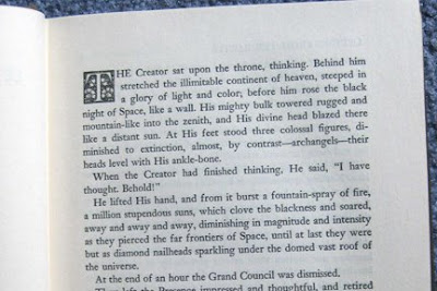
This is an image of the first page of Mark Twain’s “Letters from the Earth” edited by Bernard Devoto, ©1962 The Mark Twain Co. and published by Harper & Row, NY.

The book is a novel by Mark Twain that I checked out of the library to read. It was written to entertain and also to make people think more deeply about God and his creation of the world. This page is the first page of the novel.

What caught my eye first on the page is the capital T and the ornate box that it is enclosed in; it is reminiscent of Geoffrey Tory’s criblé and floral initials that he created in the 1500s. It has floral design as well as the criblé markings (the small dots) in the empty spaces. It is smaller and uncolored, though, while I think Tory’s initials were larger and usually in color.

I also looked at the typeface used for the book: Linotype Janson. When I looked it up, I found that it is based on a 17th century Hungarian old-style serif typeface that looks similar to many of the old-style typefaces we have been looking at in class. It uses ligatures for certain letter combinations, such as ‘fl’, which I usually don’t notice in most books I read—though perhaps I just pay closer attention now that I am more aware of them from the class!

Also, we obviously see the “modern” clean and simple design of the book with its empty and wide margins around the text.

I like the fusion of the old and new that this book presents; with the subject being religious in nature, I think it is fitting to have an old-style typeface as well as ornate initial on the page. The modern book design, though, allows the book to fit into modern-day standards and norms that we are used to so that it is still easy to read.

Sources: http://en.wikipedia.org/wiki/Janson

Thursday, February 19, 2009

After Class 2/18

Chapter 8: An Epoch of Typographic Genius – Including the Romain du Roi typeface, Rococo period, Old Style/Transitional/Modern type, and influential typographers

French King Louis XIV commissioned the Romain do Roi to be created for his Imprimerie Royale printers; the typeface had increased contrast between thick and thin strokes, sharp horizontal serifs and balance; it was illegal for anyone besides the King’s people to use it. It was the first of the “transitional roman” types; later, Baskerville’s transitional typeface, which he printed on woven paper for a smoother finish, was seen as a “transitional” type too. Caslon’s type looked more hand-written and “friendly to the eye” and was considered an “Old Style” typeface with its bracketed serifs and uniform thickness. Didot and Bodoni’s typefaces were seen as more mechanic and considered “modern” because of their narrower and more geometric letters with a vertical axis. The Rococo period featured fanciful French art and lasted from 1720-1770. It was floral, intricate, asymmetrical, and featured many scrolls and curves. Also during this epoch of genius we saw the start of information graphics, like charts, as well as le Jeune pioneering the standardization of types and type faces.

The most useful parts of the chapter to me were analyzing the different typefaces and the differences among them, which made me look more closely at typefaces in general, as well as able to see the differences in typefaces used today. It will make me think and look more closely at the typefaces I use in the future.

Were the promiscuous/entertaining texts back then used by the rich, who also spent their money on the religious texts, or were they used by the poorer people?

Wednesday, February 18, 2009

Chapter 8

Chapter 8: An Epoch of Typographic Genius

This chapter delved into the time of mastery over typography. This all began with French King Louis XIV and his Imprimerie Royale, his royal printing office. Under his commission in 1692, mathematician Jaugeon created the Romain du Roi typeface, which had increased contrast between thick and thin, sharp horizontal serifs, and more balance. It became the forerunner of the “transitional Roman type” category. The Rococo period followed with the influence of fancy French art: floral, intricate, asymmetrical decoration with scrolls and curves, classical and oriental art, and colors that ranged from pastels to ivory and gold were in. In 1737, Fournier le Jeune pioneered standards of type by publishing a table of proportions. He made many other contributions, including publishing manuals of typography. Over the years, engravers became more skilled and began to produce books by hand-engraving both illustrations and text. In 1722, William Caslon created his Caslon Old Style; Baskerville was an all-around book designer who first came out with a shiny page of type, using an unknown method to achieve the luster. Bodoni’s page layouts, which lacked the extravagance of former styles, introduced the simplistic modern layouts that we know today.

I think I was most excited in this chapter to see names that I recognize, especially type faces (Caslon, Bodoni, etc.). I was also happy to see the influences that are more prevalent today, and the simplistic book designs that we all know.

Why was the Rococo period called the “Rococo” period? Where did that name come from?

Tuesday, February 17, 2009

After Class 2/16

1. Name of graphic style (or topic) studied this session:
In class 2/16, we studied Gutenberg’s influence on typography and how it affected societies; broadsides; Albrecht Durer; Martin Luther; Venice and the Renaissance there; Nicolas Jenson; Ratdolt, Manutius and Tory—all Renaissance men of their times.

2. Describe specific qualities of this style (or if it’s a topic-highlights of that topic) that will help you identify it in the future.
Typography affected society by reducing the costs of text which led to widespread literacy (even in less fortunate people); spreading ideas and sciences; stabilizing languages; individualism; and more. Martin Luther’s Ninety-Five Theses were proliferated around Europe thanks to Gutenberg’s advances of printing, which led to the Reformation of Christian faith. On a smaller scale, broadsides, which were single-leaf pages printed on one side, evolved into posters, advertisements and newspapers. Albrecht Durer, who was the master behind “The Apocalypse” perfected Roman capitals with his use of geometry and also brought the Italian Renaissance to Germany after studying there. Ratdolt was a Renaissance man who got out scientific ideas, such as the solar/lunar eclipse, into print. He also had the first complete title page, the first type specimen sheet, and the first dye-cut in a published book. Manutius was also a Renaissance man who started the printing of pocket books; helped develop italics, printed the works of many great thinkers; and had the first logo. Finally, Geoffrey Tory, the greatest Renaissance man of all, was proficient in twelve different areas of study; he greatly influenced the French alphabet and grammar with the introduction of the cedilla, apostrophe and accent. His three-volume work, Champ Fleury, influenced his whole generation of print makers.

3. What is the most useful or meaningful thing you learned today?
I liked looking at the progression of the “Renaissance Man” especially in Italy. The men who worked in earlier times seem now not to have discovered anything so profound compared to the men who succeeded them, but without those first accomplishments, their followers may never have reached the conclusions that they did. Even the smallest achievements back then were and still are a great impact on humanity.

Question: When the Renaissance time period was reached, were books and printed materials still used mainly for religious/scientific purposes, or were they being used yet for other areas or even for entertainment?

Sunday, February 15, 2009

Chapters 6 & 7

Chapter 6: The German Illustrated Book

Incunabula means “cradle” in Latin; fittingly, 17th century writers used the term as a name for the books Gutenberg printed with his typography up until the end of the 15th century. Broadsides, or single pages that were printed on only one side, evolved into posters, advertisements and newspapers. Albrecht Durer also lent value to illustrated books through his 1498 edition of “The Apocalypse,” with 32 16”x12” pages including 15 woodcut illustrations on each right-hand page; and through his 1525 book, “A Course in the Art of Measurement with Compass and Ruler,” his first book.

It was most interesting to read about the flourishing of typography and the boom of printing shops to the point that there were too many for them all to have enough business. It’s sort of amusing because it now seems so elementary or basic, but then it was such a huge new technology, and it’s not until one analyzes the effects of easy printing that one can see why it was such a fantastic achievement.

///

Chapter 7: Renaissance of Graphic Design
This chapter focused on the renaissance of GD, or the transition of graphic design from the medieval times up to modern times. Venice was the powerhouse of typographic book design in Italy; de Spira had a 5-year monopoly on printing, and his innovative and attractive roman type (as well as France’s Jenson and his roman type) ushered in new fonts that closely resemble those we most use today. Floral decoration was used prominently on designs. Ratdolt made an impact as well with three-sided border illustrations, small geometric figures, and his best-selling “The Art of Dying.” The rapid boom of literacy allowed calligraphers to have new jobs of teaching newly literate people how to write when their old jobs were replaced by printing presses. Typographic printing had many effects, including reducing the cost of books/printed materials, spreading ideas and knowledge, stabilizing and unifying language, the helping literacy increase.

I really just enjoyed looking at the evolution of the many book pages pictured throughout this chapter; there were so many names and dates that it became more telling to look at the pictures and see the progress and changes in those than to read about them. It also was inspiring to see the different layouts and illustration styles that we rarely see today.

With the ability of typographic printing presses, how did illuminators keep up with the many sheets that were printed? I know many times woodblocks and carvings were used, but wouldn’t these wear down to the point that many copies of the carving be needed?

Weekly Image

Pictured above is an inside page for a flyer promoting “Ms. Coffmansen’s Portfolio Finishing School for Good Girls and Boys.” I picked up the flyer from the Eisner Museum in Milwaukee.

The function of the page is to promote the school and describe how students are taught and treated, as well as show testimony/images of work from successful students.

The style of the brochure is very aged and worn-looking, with warm colors like red, orange and gold. The headlines and sub-heads use a larger, gothic-inspired font to make them stand out from the rest of the text on the page; the larger size of the letters makes them easier to read than if they were any smaller. The body text uses a common serif font, which makes the bulk of the text easier to read than if it were written in the gothic font.

The artwork is dynamic and interesting, even as a background to the page. The images used to display previous students’ work is also of good output. However, I feel like the students’ images look awkward when compared to the rest of the page—the feeling of antiquity and roughness is shattered with a picture of a modern day machine, as well as crisp and clear imagery. I feel like perhaps there could have been some other way to incorporate the images or make them feel more rough—like make the outline a ripped page instead of a simple black line. But I really liked the piece because it reminded me of the illuminated manuscripts we have been studying, with the parchment/rough texture and warm colorings (red and gold especially), as well as the use of black lettering with bigger letters beginning each paragraph.

Friday, February 13, 2009

After Class 2/13

1. Name of graphic style (or topic) studied this session:
Today we talked about illuminated manuscripts as well as printing’s beginnings in Europe.

2. Describe specific qualities of this style (or if it’s a topic-highlights of that topic) that will help you identify it in the future.
Celtic manuscripts were very ornate and decorated; full pages of decoration were “carpet pages.” Romanesque/Gothic design, like the Douce Apocalypse, used the dense littera moderna (textura) type. Late Medieval texts, like the Book of Hours created by the Limbourg brothers, were also very ornate and used different colors of type like red to call out important things.
Gutenberg was the first to make movable type in Europe and did so by perfecting the metal alloy for the type molds. He first printed the 42-line Bible. Playing cards were the first pieces printed that all classes could obtain.

3. What is the most useful or meaningful thing you learned today?
It was useful to see the transformation of the different illuminated texts; in a way, you can look to your own designs and see an evolution of design that reflect who you were/how you thought at the moment, just as it seems in illuminated texts.

4. Question:
Did Gutenberg share his special alloy mix with others right away to help movable type along, or did others have to figure it out on their own?

Thursday, February 12, 2009

Chapter 5

Chapter 5: Printing Comes to Europe

Typography, or the “printing with independent, movable, and reusable bits of metal or wood, each of which has a raised letterform on one face,” helped knowledge and literacy to quickly spread throughout the world once it was invented. Europeans first used woodblock printing, making playing cards a very popular item among rich and poor alike, as well as proliferating devotional and religious matter. When paper was finally introduced to Europe, the want for books soared. In 1450, Gutenberg was finally able to put a system together and print a typographical book. The typeface had to be precisely made out of metal casts so that all letters would be the same sizes and align evenly, as well as last for thousands of imprints. Gutenberg saw many of the first, most popular texts printed from his presses, including the first typographic Bibles; and printers Fust and brought about two-part metal blocks that could print two colors, just one of their many achievements. Copperplate engraving as a means of printing was popular too, and it is thought that Gutenberg most likely had a hand in this as well.

What I thought so interesting about this chapter was that movable type came into being long before I thought it had, in 1450—over 500 years ago. I thought it would come to be much later in history.

Was Gutenberg influenced by the Asian’s discovery of movable type, or did he innovate this for the Europeans on his own with no influence from the outside?

After Class 2/11

1. Name of graphic style (or topic) studied this session:
We briefly talked about the Asian influence of language and typography.

2. Describe specific qualities of this style (or if it’s a topic-highlights of that topic) that will help you identify it in the future.
Chinese started out with bone-and-shell script, reading the cracks in bones formed from a hot poker. It then moved to writing on bronze, often in vessels like pots, etc. Regular style calligraphy then came into use and has been ever since; the strokes of the calligrapher can represent spiritual and emotional states of the writers.

3. What is the most useful or meaningful thing you learned today?
I thought it was very interesting that the calligraphic strokes can represent emotional and spiritual feelings of a writer; in simplistic designs, I think it would be very useful to keep this in mind as it would perhaps give a deeper subconscious feeling to pieces of design I work on.

I also learned not to try to learn Chinese—over 40,000 letterforms…yikes.

4. Question:
What made diviners shift from only disentangling prophecies out of cracks in bone to turning those cracks into their own forms of thought in written form?

Tuesday, February 10, 2009

Chapters 3 & 4

Chapter 3: The Asian Contribution

The Chinese civilization’s origin is steeped in mystery, but we do know that their language system has always been based on pictorial representations of words rather than an alphabet of letters, logograms presumably first written in 1800 BC by Tsang Chieh. The earliest writings were called chiaku-wen (“bone-and-shell” script) from 1800-1200 BC; the chin-wen (“bronze” script) followed. Emperor Shih Huang Ti united all written Chinese forms in the 3rd century BCE. Finally, chen-shu (“regular” style) script was created and has been used for almost 2000 years. The ink figures can vary by each writer; every stroke of every letter is a form of art to the Chinese. In 105 AD, Ts’ai Lun is said to have probably been the man to have invented paper; another breakthrough by the Chinese was that of printing, beginning with the carved reliefs that Chinese would make for seals. Chinese created many manuscripts, and even invented the first playing cards.

What interested me the most about the Chinese culture is that they were the civilization that created movable type; but that they had over 40,000 different logograms to move around instead of the normal 26 letters that we have today.

I wonder, would it be worth their time to print out documents with movable type (1000 years ago) if one had to find one symbol of type amongst thousands, instead of just one letter out of 26?

\\\

Chapter 4: Illuminated Manuscripts

Illuminated manuscripts were popular beginning in the late Roman Empire until through the Renaissance time period. Classical style manuscripts were layouts of text with small, crisp illustrations; there was often one column of text and illustrations were framed with bright strokes of color. Celtic manuscripts were more abstract and complex; vivid colors fill the pages, as do woven intricate textures and patterns; full-page illustrations were used, as well as large initials on opening pages. After time, spaces were left between words to help readers, and half-uncials began to be used too. During Charlemagne’s reign in the late 700s-early 800s, he standardized page layout, writing style and decoration. Caroline miniscules was the accepted writing style; pictures were often given frames to give an illusion of depth. Spanish manuscripts started to adopt Islamic motifs like flat, broad shapes of color decorative and intricate frames, and intense color. Romanesque/Gothic manuscripts saw a revival of religious themes and used intense Textura (black, strong) type. Judaic manuscripts, though rare, are remarkable examples of painstaking illustration and calligraphy. Islamic manuscripts became increasingly ornate with geometric and arabesque designs, little blank space, but rarely any figurative illustration. Late medieval manuscripts were the most ornate and beautiful of all; they were daily devotionals of prayer and their gold-leafed, jeweled, richly illustrated beauty represented the esteem the book’s owner held for God.

The difference in each region's design and reverance of the illuminated manuscript was the most interesting part of the chapter to keep tabs on. It showed a lot about each culture and the importance they felt for scribes and literature, for the proliferation of knowledge, culture and religion. It also showed the extravagance that some cultures would go to, sometimes overly extreme, that perhaps gives away insecurity that a culture felt under the scrutiny of divine eyes.

What I question is were all important manuscripts written in these styles, or was it always just manuscripts that concerned religion?

After Class 2/9

Name of graphic style (or topic) studied this session:
Alphabets

Describe specific qualities of this style (or if it’s a topic, highlights of that topic) that will help you identify it in the future:
The Greek alphabet was a major achievement because it was the first to have vowels and be more phonetic; aesthetically, it was more geometric, symmetrical and organized. The Roman Empire, at its height in 100 CE, was also a major influence as they erected triumphal arches that introduced serifs and ligatures. Ireland had its hand in forming uncials (square, rustic lettering) as well as half-uncials, which are like our lower-case letters we have today. Finally, Charlemagne’s rule in 768 CE dictated that Caroline Minuscule/Carolingian hand become the standard of writing to his people.

What is the most useful or meaningful thing you learned today?
I enjoyed learning about how language is finally starting to look like that of our own language; it is interesting to see how much it had evolved at first (since ancient times) yet how little it seems to have evolved since Roman times as well.

Question:
What led the Celtic peoples to create half-uncials?

Monday, February 9, 2009

Reading for Class 2/9

Chapter Two: Alphabets

Early forms of written language were comprised of pictographs for whole words instead of written forms for individual letters; Crete pictographs are speculated to be the origin of the modern-day alphabet. The North Semitic people, however, are believed to be the creators of the first alphabet. Around 1500 B.C., Sinaitic script was developed by Egyptian workers, followed shortly by Ras Shamra, a "true Semitic alphabetical script" minus any vowels. The oldest forms of Hebrew were found from 1000 B.C. Arabic writing, developed before 500 A.D., added six vowels to the end of the Semitic alphabet, spreading to become the most widely used alphabet today. Greece's alphabet developed earlier than the 8th century B.C., and the country's great success and influence spread the language through many lands and influencing the letterforms that we use today derived from the Latin alphabet.

I found the Phaistos Disc to be an interesting piece of the chapter that stuck out to me. Probably because I was just visiting Crete in Greece, and got to see the disc in person, it especially connected with me. It is also a great mystery that people will speculate about for a long time (perhaps forever), but the beauty and design of the disc is something that will continue to be admired as well. It is an example of moveable type, and it is astonishing to me that thousands of years ago these people were able to come up with the concept of type like that.

The question I ponder as I read this chapter is, how different would things be if we’d all used the same alphabet—would we have advanced to something far beyond our intelligence, or would only using one alphabet form have stifled our minds?

Sunday, February 8, 2009

Weekly Image


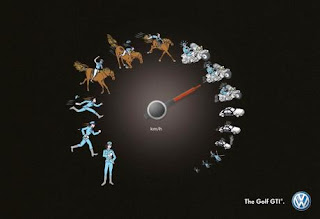
Describe what it is: This is an ad for Volkswagen’s Golf GTI car.

Describe its function: The ad is showing pictographs of people/vehicles along a circular progression, which simulates the idea of a speedometer of a car. This shows the progression that the car’s speed takes, starting out with the slowest speed (which is akin to the walk of a police officer) and going up to as fast as a helicopter. This is supposed to show the range of pace the car can take, ultimately out-speeding a car to reach speeds of a helicopter (yeah, okay).

Describe where you saw it: I saw it on the Ads of the World advertising archive: http://adsoftheworld.com/media/outdoor/volkswagen_golf_gti_police

Discuss the style of the design & typography: The design is pretty straightforward; the pictographs are easy to recognize for what they represent, like a police officer standing, then running, then sprinting, etc. There is barely any typography, which allows the images to do all the “talking” for the ad. The only typography is the km/h, which simply helps to get across the idea of a speedometer, though I don’t think that was even needed in the ad to get that point across.

Discuss the quality of the artwork: The artwork is very detailed for such small pictographs, but that helps to get each individual picture’s specific idea across.

Discuss what attracted you to the piece: The movement of the piece attracted me at first, I think, because of the circular motion that moves your eye around the piece and back to the beginning of the speedometer, allowing you to take it in as a whole at first. Then on second look, all the components come together overall and you see it as a speed dial. Also, I like the way the artwork is rendered, almost like the pictures are hand drawings. It gives the piece an older feel, like it is around the comic book era, when car races and speed (Speed Racer) were popular. I like that feeling it gives to the ad.

Describe how it relates to what we have discussed or read: This relates to the idea of simple pictographs portraying ideas like the ancient styles of handwriting. The pictographs/ideographs that are used here show pictures/give the idea of people running, driving, chasing, etc. This is a good example of how simpler images can come together to create a bigger thematic idea.

Saturday, February 7, 2009

After Class 2/6

1. Name of graphic style (or topic) studied this session:
Ancient writing styles - pictographs, ideographs, cuneiform, hieroglyphics

2. Describe specific qualities of this style (or if it’s a topic-highlights of that topic) that will help you identify it in the future.
Ancient writing styles were first made of pictographs and ideographs that represented a word or idea. For example, the word "fish" was a picture of a fish. Cave paintings in 8000 BC used this type of writing style. Hieroglyphs are the most recognizable forms of ancient writing. Cuneiform followed that in 3200 BC, a style of writing made with wedge-shaped strokes.

3. What is the most useful or meaningful thing you learned today?

I never thought of trying to use my own pictographs or ancient writing-inspired type/pictures in my designs. But it would be an interesting approach to take in an appropriate context to try to push myself to fit an idea or word in one image.

4. Question: How did some languages communicate without letters/words (like Phoenicians, who had no vowels)?

Thursday, February 5, 2009

Reading for 2/6: The Invention of Writing

When Homo sapiens surfaced in history is unknown, but the earliest forms of human markings were found in Africa dating from over 200,000 years ago as cave paintings. Geometric symbols, man figures and animal symbols were used; later, these symbols were abbreviated to the bare minimum, mostly using just simple lines. As ancient cultures evolved and records had to be taken of crops, taxes, and much more, pictographic drawings and numerals were developed and used. Cuneiform writing (using a wedge-shaped tool) made writing faster and easier, and scribes began to expand the meaning of one pictograph into several ideas. Eventually, written symbols became signatures for people, and cylinder seals engraved with pictures were used on clay to indicate the writer’s or artisan’s identity. The abstract symbols, like the hieroglyphs found on the Rosetta Stone from 197-196 B.C., stumped scholars for ages until Jean-Francois Champollion made a breakthrough in 1822. The Egyptians also made skilled use of papyrus, which gave rise to many manuscripts that we hold in historical reverence today, such as the Book of the Dead. By using our knowledge of hieroglyphs and their meaning, as well as the many clay tablets and papyrus forms of writing, we have been able to unlock the secrets of ancient nations that were long silent legends.

In the reading, I found Jean-Francois Champollion to be the most interesting figure. It took about 2000 years for anyone to break through the hieroglyphs' meanings, and that he was the man to do it automatically catches my attention. I don’t know how long he had to study the Rosetta Stone to find the names “Ptolemy” and “Cleopatra” but I can only imagine it took unnumbered hours of frustrating, fruitless analysis. Not only did his discoveries help to uncover information about the Egyptians, but it also gave rise to information about the cultures and people that preceded the Egyptians, as well as probably shed some light onto what happened following the Egyptians reign.

Although many languages may use the same letterforms, Chinese and English symbols greatly differ, as well as Greek, Hebrew, Arabic and more. One question I still have is what path written language took to form the different symbols of different languages.

Wednesday, February 4, 2009

2/4 After Class

1. Name of topic we looked at this session, dealing with history:
Ancient Cavemen Communication - Heiroglyphics

3. What is the most useful or meaningful thing you learned today (from class Wednesday)?

How difficult it is to convey certain ideas or words without using the alphabet/symbols, and how we can find just the right graphics to help convey ideas. Even just trying to convey the idea of "there were" had me at a loss, as did trying to convey colors without using the actual color.

4. State at least one question you have after the class.
How many heiroglyphs did the cavemen have so that they were able to understand each other and communicate?