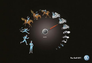
Describe what it is: This is an ad for Volkswagen’s Golf GTI car.
Describe its function: The ad is showing pictographs of people/vehicles along a circular progression, which simulates the idea of a speedometer of a car. This shows the progression that the car’s speed takes, starting out with the slowest speed (which is akin to the walk of a police officer) and going up to as fast as a helicopter. This is supposed to show the range of pace the car can take, ultimately out-speeding a car to reach speeds of a helicopter (yeah, okay).
Describe where you saw it: I saw it on the Ads of the World advertising archive: http://adsoftheworld.com/media/outdoor/volkswagen_golf_gti_police
Discuss the style of the design & typography: The design is pretty straightforward; the pictographs are easy to recognize for what they represent, like a police officer standing, then running, then sprinting, etc. There is barely any typography, which allows the images to do all the “talking” for the ad. The only typography is the km/h, which simply helps to get across the idea of a speedometer, though I don’t think that was even needed in the ad to get that point across.
Discuss the quality of the artwork: The artwork is very detailed for such small pictographs, but that helps to get each individual picture’s specific idea across.
Discuss what attracted you to the piece: The movement of the piece attracted me at first, I think, because of the circular motion that moves your eye around the piece and back to the beginning of the speedometer, allowing you to take it in as a whole at first. Then on second look, all the components come together overall and you see it as a speed dial. Also, I like the way the artwork is rendered, almost like the pictures are hand drawings. It gives the piece an older feel, like it is around the comic book era, when car races and speed (Speed Racer) were popular. I like that feeling it gives to the ad.
Describe how it relates to what we have discussed or read: This relates to the idea of simple pictographs portraying ideas like the ancient styles of handwriting. The pictographs/ideographs that are used here show pictures/give the idea of people running, driving, chasing, etc. This is a good example of how simpler images can come together to create a bigger thematic idea.
I like how you mention the simple images working together to create a bigger idea. Maybe if I saw it in print I would like it more. The size of the individual pictographs is a little confusing. Moving from large to small helps it create the idea, possibly, of gaining ground. Starting with the motorcycles it started becoming difficult for me to decipher the image. If I were a customer flipping through a magazine, I would probably need to take a second look to understand what is trying to be conveyed.
ReplyDeleteI like the reference you had to Speed Racer. I agree; the artwork does have that feel about it.
After looking at this advertisement, it is very catching to my eye. This is an image that will make you stare at it for more than a few seconds to understand what is going on throughout the whole image. One thing that I have to comment on though is the momentum that is traveling throughout the images from left to right. It was a good idea to start with a human and show them still, walking, and running. But, the transition between the frantic running and the still horse does not seem to pass on the momentum they are trying to portray. Yes, the horse is naturally faster than someone running. But, the intensity you see from the person running to the horse does not pass very well throughout the images. This happens when the image changes throughout the whole advertisement.
ReplyDelete